Helium Edge
An application tracking system that allows recruiters to collaborate with hiring teams and source potential candidates.
My Role: User Research | Wireframing | Visual Design (Partial)
Overview
A design from scratch, Helium Edge provides for all recruiter needs and increases efficiency in performing day to day tasks. An ATS functions by primarily filtering applications automatically based on given criteria such as keywords, skills, former employers, years of experience and schools attended. In order to make a highly intuitive product, I had to extensively understand the lifestyles of recruiters.
Target Audience
METHODOLOGY
A product of Sapot Systems, stakeholders for this project are spread out across the globe. The application was divided into sections that had to be covered one after the other. An agile approach, allowed us to achieve complex tasks within specified timeline.
Designs
We delivered the following interfaces:
Dashboard
Create New Form
Listing
Entity Details
DASHBOARD
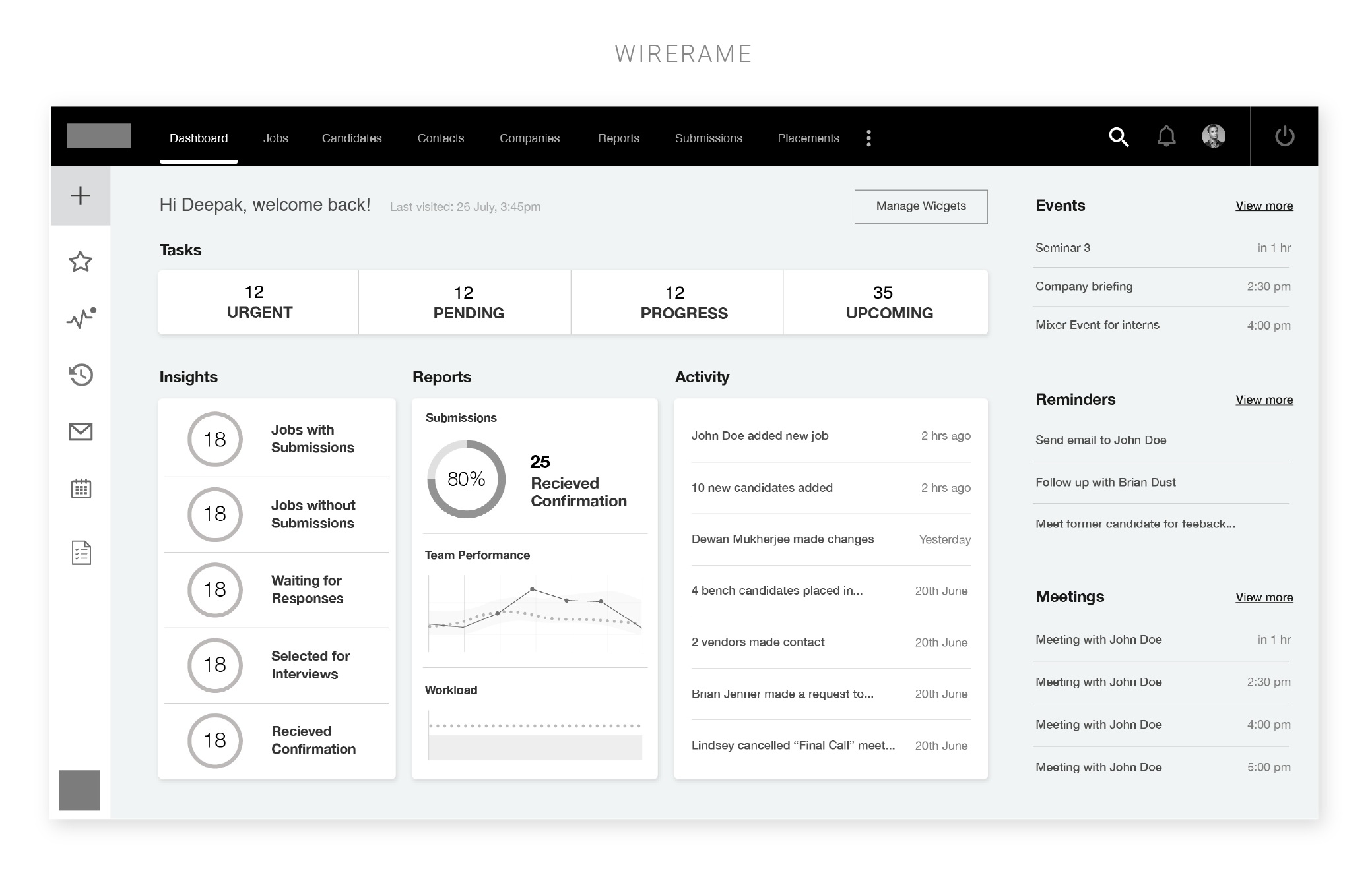
The dashboard is the landing page which the user sees as soon as he/she logs into the application. The screen had to showcase all relevant information that any recruiter would require to kickstart the day. The dashboard allows the user to personalise the showcased information via customisable widgets. (Visual design by GDD Team)
CREATE NEW CONTACT
This task allows users to add entities to the ATS like new companies, new jobs or candidates. The process is fairly time consuming and repetitive which is why we had to allow for a clean / uncluttered form format with sections that could be accessed quickly to ensure efficiency. (Visual design by GDD Team)
LISTING
Each entity had a listing of all the entries that the user can access. Since this would be an information heavy screen, the design had to be breathable to reduce visual cluttering. (Visual design by GDD Team)
ENTITY DETAIL PAGE
Each entry in the list will take the user to a dedicated profile page that will showcase all related details. These pages had to be exhibit multiple data points without overwhelming the user. I made details for 3 entities - Company, Contact and Candidate. (Visual design by GDD Team)


