10times
World’s leading B2B event discovery and networking platform.
My Role: Research | Information Architecture | Wireframing | Prototyping | Visual Design
Overview
Business professionals are always on the lookout for worthwhile opportunities. Current professional platforms cater to primarily finding jobs however, fail to provide much needed user engagement such as business event discovery, networking and communication.
Spread across 10,000 cities, It is a platform that provides opportunities to exhibit, speak, sponsor and attend events, conferences and tradeshows.
Understanding the users
Objective
Among other things, one of the main objectives for this project was to create a networking platform (Mobile website) that would encourage users to connect with other professionals, start conversations, engage in meetings and generate more business opportunities.
INTRODUCING, THE DASHBOARD!
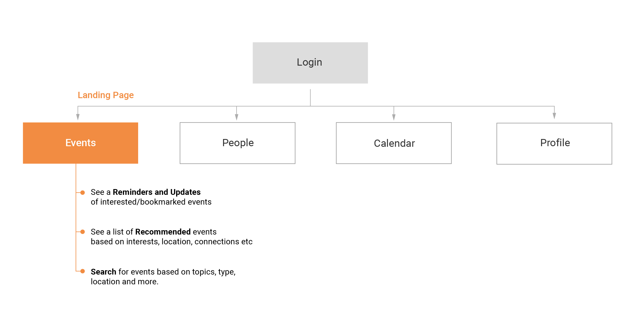
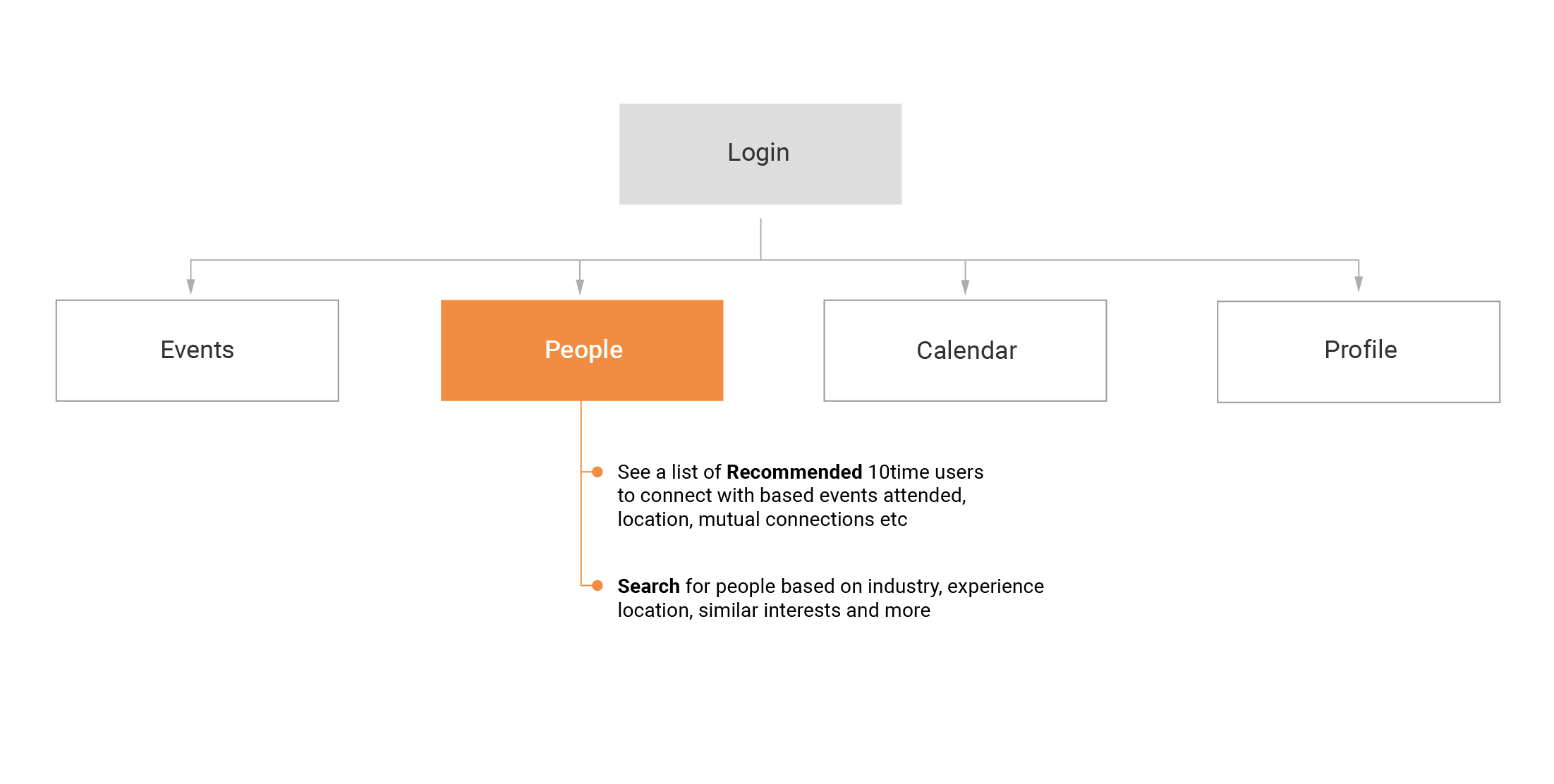
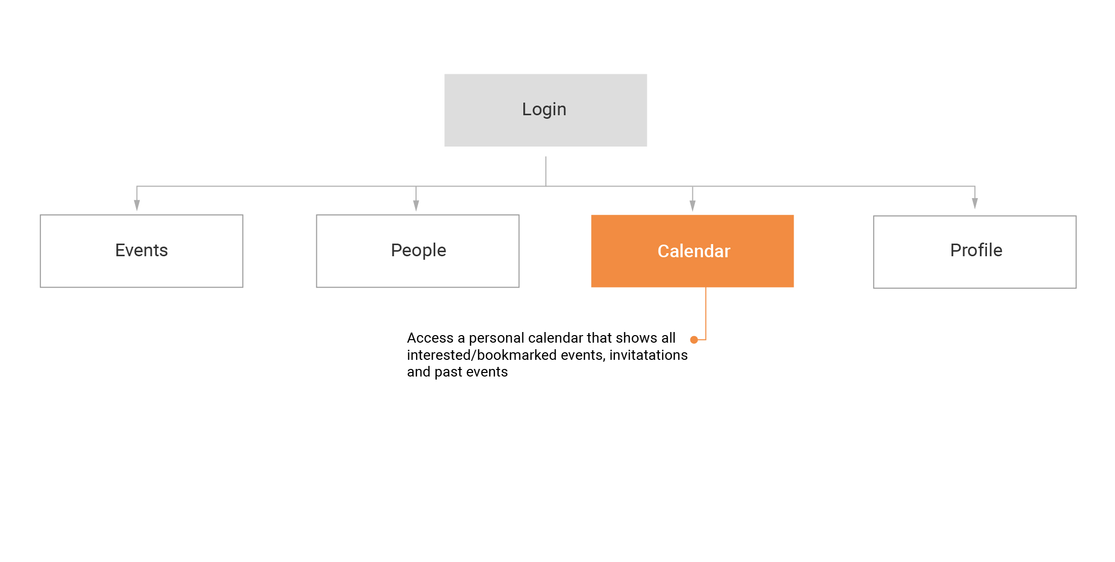
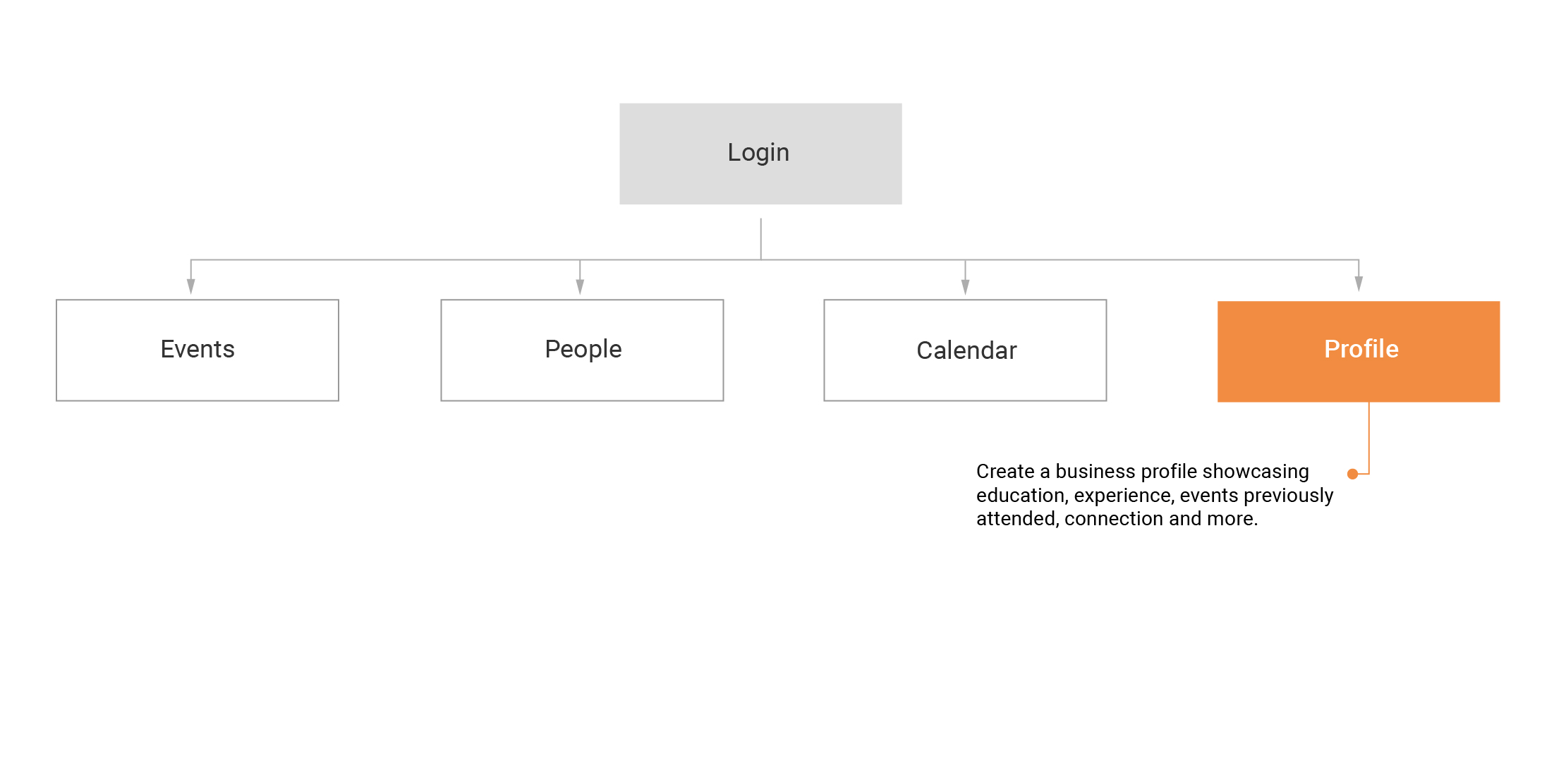
After signing up for 10times, users get their own dashboard that showcases an array of recommended events, people to connect with, a personalised calendar and business profile.
Experience framework
The following visual chart showcases the various stages a user experiences while interacting with 10times via events. A user first discovers an event while browsing the website. Shows interest to attend an event and thereby becomes a member of the platform. Lastly, receives updates and reminders of the event and others similar to it.
Information Architecture


Challenges
10times as a web service platform is heavily dependant on SEO capabilities. As such, the website was text heavy in order to maximize the effectiveness of SEO.
Therefore, the new design had to ensure that the website looked clean and visually balanced so that the users did not feel overwhelmed by the plethora of text available.
All images on the website were either logos or marketing banners to promote events, conferences etc uploaded by users themselves. Many of the users did not possess any marketing pictures and the ones who did, offered poor quality images and textual posters.
The new design had to create visual appeal without using many images in the overall layout.
10times vision for the user dashboard was to engage users who have already joined the platform. This meant that the content, visuals and interaction had to keep the users interested and encourage regular use.
The new design had to to drive engagement on the platform which is why we opted for a growth driven approach.
Wireframes
Final designs
Events Home Page
We transformed the home page from a simple listing to bite size cards of curated event.
People Page
Similar to the home page, The People section evolved from a regular listing to a more diverse pattern using varied card formats.
Calendar Page
We designed a more user friendly calendar by providing better visual cues and added date and month filter controls.
Profile Page
We created a visually appealing and balanced profile page with a structure information hierarchy.


